Table of Contents
Better web design can really help a business or company lift its reputation and improve the number of sales or enquiries it’s getting, as well as first impressions.
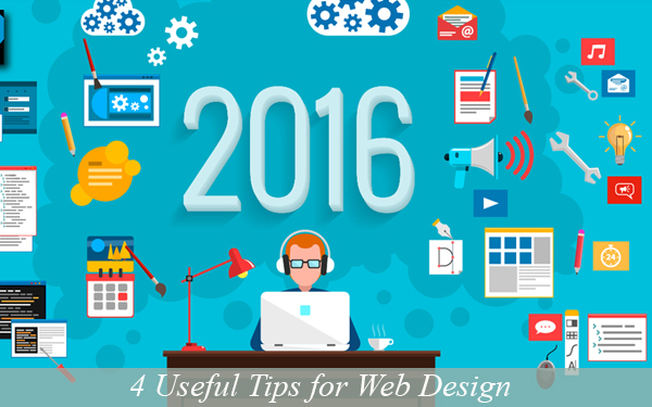
We asked agencyinc.co.uk for some tips on what people should expect from sites in 2016.

Keep things clean and free of clutter:
The modern world we all live in has gotten very cluttered; the Internet is no different. Buttons, signs, icons, ads, banners, and badges, pop-ups: the list goes on, and it’s often just too much to deal with. Spare your website visitors all that and give them a quiet and clutter-free space to relax from the general online madness. Flat design as well as white space are both great concepts to embrace and make a seriously positive impact on the experience of your visitors. Keep things simple or minimal by only highlighting the most essential content. Less often is more online.
Recon other web design:
If you’re browsing this article, then you’ve already started. However, why not take the research to a new level and begin analyzing websites through a new eye: identifying the aspects you like and the factors you don’t. Jot down actual notes on anything specific you’d love to replicate on your own page. Would long scrolling pages work on your page? Does someone have a great contact page you like? You can pull elements as small as recreating specific icons. Anything you find personally appealing is something you should use as inspiration in your own design.
Use visual hierarchy:
What’s visual hierarchy again? It’s basically a term that specifies that people’s eyes pay visual attention to online spaces in particular patterns which you can use to highlight the content you think is important. For instance, if you have a “Register” button, then you want a lot of people to click on it and register with your. The concept of visual hierarchy lets you know that people’s eyes move from top to the bottom, and from left to the right. So, you’ll get more eyes on your “Register” button if it’s near the top-left corner of your page. Those eyes and attention can mean more registrations. Just be sure you only put the most essential content in such an important space; if you cram too much in there, you’ll overwhelm your visitors and not generate your anticipated results.
Keep things easy reading:
Text is critical. Websites use it to give information to readers and answer their questions, even if they have yet to be asked. Having said that, don’t ask your readers to squint their eyes to read your text. A few mindful rules make this easy for you and your readers.
Be certain that any colors you use pair well together. For instance, don’t put cream-colored fonts onto a white backdrop. Website visitors are either going to need aspirin from reading it or just move on to a page they actually can read. You don’t want either outcome, so double and then triple check all text to make sure you can read it.
Avoid tiny sizes of fonts. They might seem cute, but they aren’t practical. If your readers need magnifying glasses, they aren’t going to like you.
Stick to fonts that match your theme and brand. It’s best to only use two, but you might get away with three, and of course they need to be friendly to your readers. People looking online tend to look for answers to questions, solutions to problems, or something that will make their life easier. Don’t give them a problem in the process. You need their trust before you can hope to have any of their money.

UI/UX Consultant, Photoshop, XD, SketchApp, Product Designer, Website Designer, Mobile App Designer, Expert WordPress Developer. For web/mobile design and wordpress development related projects please contact me at dibakar@themepurpose.com


