Table of Contents
A few years ago, one of my colleagues used email marketing to promote his Shopify store.
His campaigns were insanely profitable at first. For an entire year, had an average ROI of over 5,000% and was netting over $2,000 most days. He thought he was home free, until the ROI of his email marketing campaigns collapsed.
He realized that he needed to make some serious changes to maintain his campaigns. He split-tested a number of new variables, which included a new email design. The new design changed the performance of his campaigns and they were doing better than ever!
Creating profitable email marketing campaigns with boring layouts doesn’t always cut it anymore. Sometimes, you need a new design to kick your campaign into overdrive.
Here are some great email design ideas for your next campaign.
1. Animated GIFs

Animated GIFs can make your emails much more engaging. Mika Osborn came up with an excellent GIF that encourages people to share content on Pinterest. The GIF says “Let’s Pin!” It is appropriately made up of pins that separate and reform.
Some of the largest brands have used animated GIFs to engage their audience. Buzzfeed began using them a couple years ago, which has helped them grow their subscriber base. Within one year, they went from having one email newsletter to 14. HubSpot attributes their growth partly to their engaging GIFs and other visuals.
2. Simple Design with Lots of White Space

Every marketer should live by the Kiss It Simple Stupid (KISS) policy as much as possible. Believe it or not, using a simple layout can be much more engaging and effective. Don’t take my word for it – see how Apple runs its email marketing strategy.
Apple uses email designs with lots of white space, concise messages and a captivating image of their product. Their layout is organized vertically and is very easy to follow. Customers will see the CTA as soon as they open the email. Paired with a quality image of the product, this will help spur the user to click the link to learn more from the Apple website.
3. Humanized Email Templates

Personalization is becoming more and more important in email marketing. The bar is also being raised. It is no longer good enough to merely reference the subscriber by name in the introductory hook. You need to find other ways to engage them on a more personal level.
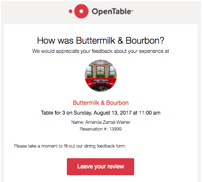
OpenTable found an ingenious approach that makes their subscribers feel special. Their email contains personalized data on every customer that uses their platform. This makes the customer see that you went out of your way to engage with them personally, rather than using the same one-size fits all approach almost every other email marketer takes.
4. Inverted Pyramid

Not every email design needs to be fancy. Something as simple as changing the organization of your text can make all the difference in the world. The inverted pyramid design is very effective, as InVision proves with their email marketing campaigns. Campaign Monitor explains the science behind this layout:
“We’re big fans of the inverted pyramid model. It’s essentially a framework for structuring the elements of your email campaigns (headers, imagery, buttons, etc) so they work together to draw people in, deliver the key messages of your campaign and get them to click-through. By guiding a subscriber’s eye down the page to your CTA, you’ll encourage them to click through to explore more of what you have to offer, resulting in better brand awareness, more web traffic, and ultimately more sales.”
Think Outside the Box with Your Next Email Design!
Bland designs just don’t cut it anymore. You need to think outside the box and find creative new designs to better engage your customers. These ideas are a great starting point, because they have performed very well for other brands.


