Table of Contents
A WordPress web design affects the most when executed with some Psychology knowledge.
No wonder, Psychology is a massive subject that might require a PhD, but there are few basic techniques one can use to know how people react to visual stimuli. Before we get deep into this, let us first figure out what exactly a web design is?
What’s a web design?
Web designing is about planning, creating, and maintaining a website. Not only you just need creativity but also need to take care of the user interface, colors, ergonomics, content, etc. Anyone who has the right knowledge of the various principles of web design can develop a website, but it also includes front end designing and the process of writing the markup.
With WordPress, you’ll get multiple themes. Some of them are free WordPress themes while others are premium WordPress themes. But, to create an effective design, one should customize a theme according to a customer, product and niche requirements to get the most out of it. This post talks about all the websites, irrespective of their platforms.
First, know your target audience!

Before creating a website, you need to understand how your product or service is going to fit into the customer’s lives. Conversion automatically gets higher if you give customers what they exactly want and what resonates with them.
You need to know the rational thinking of your customers, and understand their subconscious and emotional level of making a decision.
Basic Elements of A Web-design!
A good web design that is visually compelling and appealing always needs some elements that must be incorporated while designing a website such as:
• Shape – Shapes are responsible for creating an enclosed boundary in the complete design, so experiment with any shape that looks great.
• Texture – Texture provides your website with a feeling of a surface beneath. One should use textures in a way that they bring out the content of a website and makes it more enticing.
• Direction – For movement or motion, the direction element is important on a website. A well-crafted web design will make your eyes move from one corner to another, without any efforts.
• Color – Color holds a lot of importance in a web design, but they get added in the later instead of a later stage of designing.
Principles of Web Designing
Follow these five principles for improved conversions:
Highly intuitive structure

According to a survey conducted by Hubspot, 76% of the people voted to the intuitive structure of a website. They said, ‘The websites makes it easier for them to find what they want’. What does this statistic suggest to you?
A web page should be simple to understand so that users don’t get confused which way to go and should be self-explanatory in a clear way. Don’t let any queries come up. It helps to increase the website’s usability and makes it much more engaging. Free your structure from lots of cognitive loads so that visitors don’t have to wonder how to move from one point to another.
Visual Structure
The next principle in creating thriving and efficient websites is a visual hierarchy. It is the sequence our eyes moves in and perceives the things it sees, mainly from one point to another.
While preparing a design, a designer first should identify the order of imperativeness of the multiple topics and place them in a way that is appealing when looked from a user’s point of view. Create it in two ways:
a) Size hierarchy: In this hierarchy, the most paramount image or content is of the largest size on a web page and then follows the second largest size and so on. Be aware that while designing this structure, a visitor would look at the items as per his/her importance, so design accordingly, so that the pecking order of things is clear.
b) Content hierarchy: Instead of size hierarchy, you can also structure your website according to the content. Put the most eye-catching, informative or business-related content at first and followed by other less important. Place content in a way that the eyes first travel to the content that is most prominent.
Convenience
The next principle is the approachability of a web design. Each time a user enters your website, he shouldn’t feel strange accessing every bit of the information. So, take in care the color, background and the content used on your website. You can follow some tips as:
• Typefaces – Selecting an appropriate font type, which is readable and appealing plays a significant role in alluring visitors. They should be simple yet boast the sophistication of your website.
• Colors – Choose those colors of your websites that have the ability to create visual harmony and balance. Try selecting contrasting colors for written content and a lighter background shade to make it easier for the eyes to look and read.
• Images – A human mind process an image at much faster rate than text. Thus, it is important to choose right pictures and arrange them in an appealing layout so that they can entice the users. Ensure that the image used on a website should be of high-quality.
Hick’s Law
The Hick’s law states that more the options, the longer it takes to make a decision. The additional options make decision-making difficult and sometimes we end up not deciding at all. Let’s understand it with an example:
In a busy grocery store, a study is conducted to taste the different jam bottles. There were two options. On one table, there were six jams to try for, and out of 40 people who tried the jam, 30 bought. At the other table, 24 different jams bottles kept and out of 60 people (some bypassed it), only three bought after tasting it. (Journal of Personality and Social Psychology.79:995-1006). This research means that more options create impossibilities instead of possibilities.
Hick’s Law clearly tells us that if a customer has more choices, the energy in making a decision also increases. Eventually, it gets so large that sometimes it seems worthless. So, always remove the additional options to make a user’s decisions quicker and easier.
Content and Communications

Place “Content” image here
Every visitor of your website needs some information or content. Thus it is crucial for you to communicate with them transparently and in an appealing manner. Your information should not only be compelling but easy to read and process too. Communication doesn’t only mean written information but also about infographics and images. There are three essential principles of Web design that everyone should take into consideration.
• Provide the visitors with a simple and clear layout while keeping in mind the consistency, navigation and division of content.
• Try to deliver as much as information as possible, without any help of less visual elements. For that, designs should be clutter-free and have a high degree of clarity.
• An accessible and understandable platform is always like by the visitors. So, a website should ensure the balance between legibility, readability, views and color.
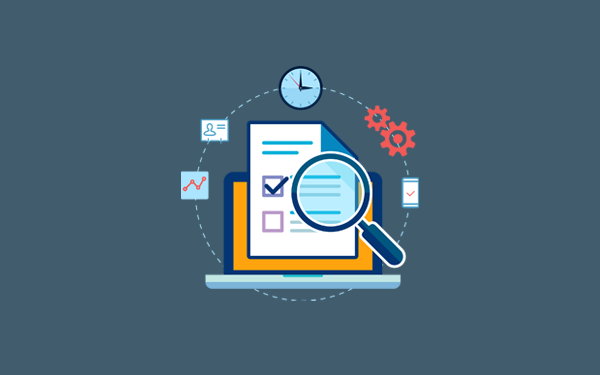
Regular testing:

TETO’ is a principle used by a plenty of designers. Conducting regular usability tests provides valuable insights into multiple problems and complications related to a website design. It is important because you don’t want your users to find your site in a non-working mode. There are two things you should consider while testing your web page:
a) Always, test your project at the very beginning and make changes if and wherever required.
b) Continue testing and modifying until you chisel out the best result.
End-Note
Nothing better than acknowledging your audience’s psychology can improve your design. There is little gumption in cutting up psychology relevant to design, but understanding the key concepts can be a powerful gateway. We hope the concepts listed in this post should be enough to keep you in the right mindset when designing and please feel free to share your ideas or principles of WordPress design.


