Table of Contents
Navigation is the core of any website. Product search, comparing different items and prices, passing through the checkout stage – all these and many other activities require well-optimized site navigation.
Optimized navigation paves the way for better user experience — a site visitor is carefully guided the whole way through a store, prompted where to go and what to do to find the desired product. That makes an overall positive impression and has a big influence on a customer’s final purchasing decision.
Generally, there are plenty of methods and design tricks to improve site navigation. However, those that can work for a clothing store may be useless for a store that sells electronics.
Below, we’ve collected 7 most universal navigation optimization ways that can be used by most eCommerce websites. Let’s begin our journey to the perfect navigation with internal linking strategy.
Internal Site Links
If navigation is the core of your store, links are the core of navigation. On top of that, a well thought-out internal linking builds a strong SEO-skeleton of your site.
When it comes to optimizing site link structure, the first thing you should do is to properly interlink all your important pages. Site visitors should be able to easily find the way to get around and find any category or product page.
Also, your potential customers should have a handy access to your refund or shipping policy pages, TOS section, etc. As not being able to find this important info, more than 60% of people usually leave a website without making a purchase.
Additionally, you need to optimize the way your links look. In other words, a link should look short and nice, not like a piece of code.
Every link should be readable and contain the way to the product and the unique product ID. In other words, a link should be descriptive.
Here is an example:
http://www.example.com/category?id17-23mgf903gafl.html
http://www.example.com/women-shorts/nike/green/small-size.html
It’s pretty obvious to identify which link is better.
The anchor (aka its title) of the link is also very important. On the one hand, it helps you increase readability of your links, on the other — descriptive titles let search engine crawlers better index your pages.
Cross Links and Related Products
While on this subject, let’s talk about cross links and related products.
Cross Links are usually used to connect products with similar features. Thus, you can interlink relevant pages and evenly distribute link juice among thematically-connected pages.
For example, you can interlink two products with a similar functionality by putting a link somewhere in the description.
Also, using cross links you can build relations between different thematically relevant site pages. For example, if you are selling products made of Polyester, you can place a link to the page that describes the fabric, its qualities, best manufacturers, etc.

Related Products are also an important part of store navigation. It’s a great cross-selling tool that helps your customers find the right product option, boost your sales and lower bounce rates.
As a rule, a section with these products is placed at the bottom of a viewed product page.
Providing customers with alternatives will make stay longer on your site, explore your other offerings and eventually find what they are looking for.

Menus and breadcrumbs
Menus of various types are another point to consider. They are the steering wheel of your site and a great alternative to onsite search.
You can organize menus in your very own and unique way, but usability should stay your top priority.
The main site navigation menu is usually placed at the very top of the page under the logo of your store and displayed on each page of your store.
Drop-Down menus are very popular with eCommerce store owners. Basically, it’s because this type of menu lets you place an extended number of categories under each section. The more active links you place in the menu the wider choice your customers will have.
At the same time, try not to overload your menus with a big number of options. Find the right balance when shaping each section.
Here is quite a good example of a drop-down eCommerce menu.

However, these days a lot of eCommerce site owners try to stand out and introduce various types of experimental navigation menus. That can be:
bottom of the screen navigation menus:

or vertical stacks:

Some go further and abolish navigation menus at all, substituting them with single-page scroll navigation:

Ah, and don’t forget about adding breadcrumbs to your product pages.
They will let you display the whole path to the product (e.g. Main page – Category page – Subcategory page – Product), so customers could see at which part of your site they are, and could jump to the sub-category, category or the main page.
This is how it will look like:

Also, by adding breadcrumbs to page markup you increase chances to stand out in Google search with optimized, extended rich snippets.
Onsite Search
Now, more and more customers prefer to avoid manual browsing through a store, and want to instantly find what they need. That’s why having a powerful, optimized search is very important.
You can improve it in various ways by adding:
Autocomplete and misspelling functionality
Most customers are always in a hurry and want to get an instant result right from the first letters of the query they’ve entered. This is the case where instant search/ search autocomplete tools can be of great help. They can help you handle any types of your customer queries and instantly deliver relevant product/category search results.
Also, these results can also include a product description, ratings, number of reviews, price and even the ‘Add to Cart’ button, so your customers don’t have to jump to the product page and can make a purchase right it in the results AJAX pop-up.

Search filters
Introducing a range of search filters will let your customers easily surface all products with the necessary characteristics. All they need to do is just to properly set the search criteria.
Also, good search differs from the poor one in the way it presents information. Simple search results should be extended with product thumbnails, short description and ratings. It will help customers get an extensive info on the searched products right in the search field.
And finally, it’s generally advised to optimize ‘No Results Found’ pages. Some links placed on this page can guide customers to alternative store pages that are correspond to the entered search query.
Filtered/ Layered Navigation
Layered navigation is used to set a number of parameters to filter out certain products according to the selected criteria. Basically, this functionality provides filters for product category, price, brand,color or any selected criteria. Basically, this functionality provides filters for product category, price, brand,color or any other available attribute.
The layered navigation section can be dynamic or static.
The dynamic one is used when you are selling different types of products. In this case, each category can have its own number of filters. The static layered navigation section is permanent and doesn’t change depending on a category.
If you are using one of the eCommerce platforms, like Magento, the layered navigation feature may be included into it by default. The only thing you need to do is to configure it the right way.

Banners and Popups
The next pair of navigational features is not very popular with site visitors. However, they still can be very effective when it comes to guiding visitors to important site pages.
Both banners and popups are frequently used as advertisement to market products or services.
Banners can save tons of time for customers who come to your store to check special offer. Imagine, your customers don’t have to browse through the store catalogue or use search. A banner with the direct link is already here to help them to get to the specific site pages. Sounds great, right?
Also, you can use banners to promote a certain category. In other words, banners are a great, attractive and attention grabbing navigation element.
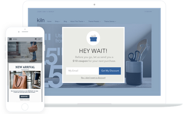
Popups basically act the same way. You can use popups to inform visitors about special offers and ease navigation. Note, that some customers may be unhappy with your popups strategy. That’s why your popups’ proposal should be less intrusive and more informative.
Read this article to learn more about the effective ways to use popups for eCommerce websites.

Analyzing Customers’ Behavior
The last tip on the list is not actually about optimizing site navigation. It about analyzing how people explore your site.
Using Google Analytics tools you can see how effective your store navigation is. You can identify you site most popular products, categories, CMS pages, and see which pages don’t get a sufficient amount of visitors.
Having this data, you can adjust your site navigation accordingly. For instance, you can place add more links leading to your least visited pages, add them to the main or category menu, promote them via banners and pop-ups, etc.
On top of that, you can even use your store search data. It should help you arrange the categories and products by popularity or relevance.
Bottom-Line
Optimized navigation is one of the cornerstones of eCommerce business. It influences the conversion rate and customers browsing and shopping experience.
Have you ever optimize your online store navigation? Do you know any special navigation optimization tricks?
Feel free to share them in the comments section below.


