Table of Contents
Are your customers abandoning your website, even though your digital marketing initiatives are driving enough traffic?
Usability factor in web design is now slowly been acknowledged as an important criteria for building brand awareness as it can play a significant role in improving a user’s opinion about a website, brand or business. However, it is found to be overlooked many a times leading to businesses losing traffic; and consequently failing to generate leads and close conversions.
So, what actually is usability for web design? It is all about making a feature or a product easy-to-use, while maintaining the high quality of the product. Recent statistics have shown that start-ups have been more successful in implementing good usability strategy into their website design as simple ideas can many a times be more innovative and usher usability.
Here in this article, I’ve tried to highlight the most commonly made (but MUST-AVOID) usability mistakes for web design.
Vague Button ‘Labels’
Button labels in a website design are meant to be self-explanatory and give out a clear message. One of the fundamentals of a web button label is that being an actionable interface element, it should always indicate what it will do for the user. For example, after presenting a fill-up form for registering and creating an account the tab or button at the end should say “CREATE ACCOUNT” or “REGISTER”.
However, many a times’ website make this avoidable mistake by integrating a button label like “Contact Us”, which do not open to the website owners contact information – address, phone number or live chat widget; but rather redirects you to a default email client. So, there is a lot of ambiguity in such unclear and vague button labels as you as a user is unsure and apprehensive what if the tab opens up at an undisclosed location.

Solution: Offer clear message in the button labels like e.g. ‘Save Post’ instead of just ‘Save’, so as to give a clear indication to the user on what to expect from the button – thus improving usability.
Overlooking ‘Blank Slate’ Design
Most of you are familiar with ‘blank slates’ in a website. Yes, you guessed it right. It is the same blank screen you confront every other day on a website, which looks like as if user has deleted all the data on the screen or hasn’t yet added any.
Now for a first time user of your site, such blank slates can be pretty confusing and suicidal as users will not know what to do in this screen and what pathway to follow.

Solution: Provide a blank slate indicator with messages like “No videos on display”, “No posts scheduled”; some prominent description about what the screen is all about, and some actionable components to direct pathways to the user for their next pertinent action (like in the image above suggesting “Create one”).
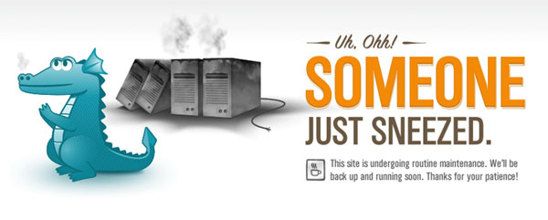
Offering users with ‘no feedback’ while making them wait
Time is money, and to wait without a hint of when you can find or see the expected action is a pain. Most of the time, website and web application users are at the receiving end waiting for some actions to happen, which they have requested. It may be loading of a page data, a high-resolution design, updating of content, etc.
Well, waiting cannot be avoided is understandable, but what about letting your users know that they are ‘kept waiting’ and if the wait is progressive and yield results. However, most websites forget these small usability factors most responsible for increasing bounce rates.

Solution: Try displaying a progress bar or spinning animation to keep the user informed of what is happening. Also, intimate the users if the site is under maintenance or experiencing uptime issues. Users will be more patient with you and comeback later, if not wait.
Smaller Clickable Areas
Many a times you must have come across tabs that look to be ‘clickable’ but are actually just partially clickable. This can be quite confusing for the user, who might not have the time or patience to move the cursor around to see – thus losing precious chances of lead conversion.
Coming to the technical perspective of this error, it happens when web designers create tabbed navigation menus using unordered lists (<ul>).
<ul>
 <li><a>Link 1</a></li>
 <li><a>Link 2</a></li>
 <li><a>Link 3</a></li>
</ul>
It happens mainly when all the style properties, particularly the padding property is added to the
<li>elements rather than to the <a> elements (where the style properties actually belong). Now, the <a> element being the only clickable part, it should ideally take up much space as possible.
Solution: It is recommended that you use padding rather than margin when styling links (without backgrounds or borders) because padding helps give much space so as to keep the clickable area nice and large.
SYNOPSIS
The aforementioned points are the most common usability mistakes designers make. Besides that there are several other must-avoid mistakes, which if taken care of can prove to be effective in improving the website usability through web design. It includes factors like link colors, confusing navigation, poor typography, not focusing on user inputs in web forms, making registration process a must throughout the website, inconsistency in design and incorrect use of images.
What other factors according to you affect the usability in web design? And can those be avoided?


