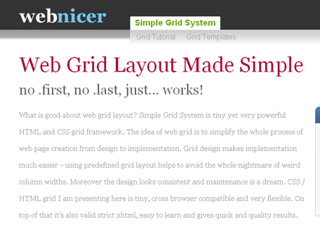
Table of Contents
Grids are an invisible foundation that structure the websites we develop and design.
This invisible foundation makes it possible for rapid development, concise code, and a much more organized layout. In this article I present a 15+ Best CSS Grid Systems on how to use these in your design. Using a CSS Grid System is really worth considering if you’re planning to create a complex magazine web design. This article will give you the overview and tools you need to get started.
960 Grid System
The 960 Grid System is an effort to streamline web development workflow by providing commonly used dimensions, based on a width of 960 pixels. There are two variants: 12 and 16 columns, which can be used separately or in tandem.

Blueprint: A CSS Framework
Blueprint is a CSS framework, which aims to cut down on your development time. It gives you a solid foundation to build your project on top of, with an easy-to-use grid, sensible typography, useful plugins, and even a stylesheet for printing.

BlueTrip
A full featured and beautiful CSS framework which originally combined the best of Blueprint, Tripoli (hence the name), Hartija, 960.gs, and Elements, but has now found a life of its own.

The Golden Grid
The Golden Grid is a web grid system. It’s a product of the search for the perfect modern grid system. It’s meant to be a CSS tool for grid based web sites. This grid system has absolute proportions, structure on the rule of thirds, contains symmetry, asymmetry, usability, accessible typography and more!

Logicss
The Logic CSS framework is a collection of CSS files and a toolset designed to cut development times for web-standards compliant web layouts and templates.

Elastic CSS Framework
Elastic is a simple css framework to layout web-based interfaces, based on the printed layout techniques of 4 columns but with capabilities to unlimited column combinations. and capacity to make elastic, fixed and liquid layout easily.

SenCSS
SenCSs stands for Sensible Standards CSS baseline, (pronounced “sense”). It supplies sensible styling for all repetitive parts of your CSS, and doesn’t force a lay-out system on you. This allows you to focus on actually developing your website’s style.

YAML Framework
YAML was conceived as a basis for developing flexible layouts, with a strong emphasis on meeting the challenges that result from working with elastic containers and varying units. All CSS components of the framework as well as the various layout methods are thoroughly documented in both English and German, supplemented by numerous examples. YAML is oriented to web standards and the demands of accessible web design. A continuously expanding active community has formed around YAML.

CSS-boilerplate
As one of the original authors of Blueprint CSS I’ve decided to re-factor my ideas into a stripped down framework which provides the bare essentials to begin any project. This framework will be lite and strive not to suggest un-semantic naming conventions. You’re the designer and your craft is important.

CSS Layout Generator by CSSPortal
This generator will create a fluid or fixed width column layout, with up to 3 columns and with header, footer and menu. Values can be specified in either pixels or percentages.

Simple Grid System
The Simple Grid System is built upon two elements: rows and columns. To make the layout construction easier, there are gaps predefined between columns. And here comes first good news: these gaps are not going to cause you any trouble. Some additional features are infinite nesting and flexible grid units.


UI/UX Consultant, Photoshop, XD, SketchApp, Product Designer, Website Designer, Mobile App Designer, Expert WordPress Developer. For web/mobile design and wordpress development related projects please contact me at dibakar@themepurpose.com


