Table of Contents
Flyers are everywhere.
They’re one of the most widely used printed marketing materials and despite the recent trend towards online advertising,
you’ll find that flyers still crop up on a day-to-day basis (especially if you’re a business owner who regular attends networking events).
But why is this? Well, flyers are popular for a reason: they remain one of the best forms of advertising/marketing. They’re cheap to produce, cheap to distribute (you can usually find a company in your local area to do this for you), and they bring people into your sales funnel (when used correctly).
However, a lot of businesses make a big mistake when it comes to flyers: they don’t focus enough attention on the design process.
The fact of the matter is that simply creating a flyer and having it printed won’t bring a positive return-on-investment unless it’s well designed and “strikes a chord” with your target audience.
If you’re struggling for design inspiration, we’ve rounded up some of the best examples on the web below:
1 – Havana Lifestyle

Havana Lifestyle offers the perfect example of a minimalistic, yet exceptionally well-designed flyer.
It’s simple and to-the-point: it lets you know when the event is taking place, what features are at each of the events (it takes place across multiple days), and who is sponsoring it (you can see these at the bottom).
What’s more, it’s a colourful and eye-catching flyer, without being too over-the-top and in-your-face: a difficult thing to pull off in the world of design.
2 – Drop Inn

Drop Inn is a hostel located in Singapore, and as you can tell from this flyer, it offers a great example of how straying from the regular rectangular flyer design can work wonders from a design perspective.
The circular shape not only stands out from the crowd, but it also invokes a sense of curiosity when you see it (i.e. “what is that weird letter “O” cut-out?”).
Despite the irregular shape of the flyer, it still contains all of the information it needs, including a location map, the address, and some information about the hostel itself.
3 – Made Closer

Made Closer is a beautifully crafted flyer, created by MadeCloser.co.uk: a website that helps you to purchase items that have been made closer to you.
One thing you may notice about the flyer is the colour scheme: typically, flyers use no more than 2-3 colours, but this one makes use of four (plus the grey colour used for background and some text).
Despite the inclusion of quite a few colours, it still works well, as these colours are kept consistent throughout the design, and they are actually used to highlight different points.
4 – Yellow

Yellow is an absolutely stunningly crafted flyer that does everything right. It makes use of just a few colours (pink, blue, green, white), while also including stunning imagery and smart design elements (notice the strange “line” effect used throughout).
It also describes the event it’s advertising perfectly, and without copious amounts of detail. It states the day of the event (i.e. “this Saturday night…”) along with the artists performing.
You’ll also notice that the less-important artists are written in a smaller font size, with the headlines written in large type. This helps make the flyer more readable and creates a hierarchy of importance within the design.
5 – Dollop

Dollop offers a fantastic example of how to use typography on a flyer. You’ll notice that it makes use of just one typeface throughout, and it’s a pretty modern and abstract typeface at that.
However, the flyer makes use of a number of different font sizes and weights to create hierarchy and draw attention to the right areas.
It also uses various colours to place emphasis on important points and separate blocks of information (i.e. each band playing at the event) accordingly.
The colours are quite “neon-like” in their appearance, which, on the black background, ensures the flyer catches peoples’ eyes.
6 – Neon Rave Kids

Neon Rave Kids is yet another great example of how to use colour on a flyer.
It’s quite a minimalistic design in general (there’s a lot of white space), which makes the use of neon colours even more eye-catching.
There’s absolutely no clutter with this flyer; it’s tells you what you need to know in a clear and concise manner, and that’s it.
Oh, and the old-fashioned tape cassette imagery is a nice touch that will no doubt resonate with the target audience.
7 – 20 Fold

20 Fold shows that once again, flyers don’t have to conform to the same rectangular shape in order to be classed as “flyers”; you can literally create any shape you like.
In this example, the designer has opted for a somewhat triangular shape. However, you’ll notice that when unfolded, the flyer is just a regular rectangular shape; it’s the creative folding that creates the design.
Again, it’s a pretty minimalistic flyer, and doesn’t overload you with information.
8 – Mixed Taste

Mixed Taste is a beautifully well-designed flyer that features a kind of watercolour illustration.
On one side of the flyer, things are kept simple with a beautiful large illustration/image, the title, and a slogan; whereas on the other side, the flyer goes a bit more in-depth regarding details relating to the lectures.
Once again, it makes use of a plenty of white space (although it’s more grey space in this example) to keep content easily readable.
9 – Spring Show 2011

This flyer for the Spring Show 2011 shows some of the most creative use of colour we’ve seen so far.
It’s an extremely minimalistic flyer in general, and you’ll notice that everything is quite clean and simple. For example, there’s an abundance of white space, along with a minimal amount of light grey text.
It’s for this reason that the blue thread design really stands out, and there’s great contrast between this and the white background.
10 – Pastilla Digital

It’s not too often that you see a flyer making use of such a psychedelic design like this one, but you have to admit, it looks incredible.
Again, it’s a relatively minimalistic flyer that makes use of a lot of white space, which is the reason that the psychedelic design stands out as much as it does.
Information is kept to a minimum; it literally only tells you a couple of pieces of information, and that’s plenty.
11 – Muah!

To some, this flyer may look a bit confusing and cluttered, but even if this is the case, you still have to admit that it’s an exceptionally well-crafted flyer that really grabs your attention.
The seemingly random arrangement of the letters is no doubt an intentional part of the design, as it invokes a sense of curiosity and tempts you into exploring the design further.
The gold and blue colour scheme is an interesting, eye-catching combination, too.
12 – Shop Spotlight

Often, flyers that make use of lots of bright colours can come across as confusing, cluttered, and somewhat daunting. However, this flyer for Shop Spotlight is far from confusing.
Despite the abundance of colour, the information is still readable, thanks to the inclusion of a box border. Plus, although it may look like there are a lot of different colours, there are only a few of them in reality; it’s the overlapping that causes the illusion of more colours.
If you want to create a bright, eye-catching flyer for your business, this is the flyer to take inspiration from.
13 – Kolor

Kolor is a wonderfully designed flyer that makes use of just two colours throughout (red and blue).
Sure, there’s also the white background, but it’s amazing how much the designer manages to accomplish with just two colours. It’s easy to keep things consistent and elegant when you only use a handful of colours like this, so keep that in mind when designing your own flyer(s).
14 – Riscopriamo II Borgo

Despite the fact that this flyer is in a foreign language, the well-crafted visual design elements still shine through.
Once again, there are only a few colours being used in this design (orange, white and brown), which is what helps tie all aspects of the design together.
By inverting the colour scheme between the front/back, this flyer remains simple and minimalistic, while having a beautiful level of depth to the design.
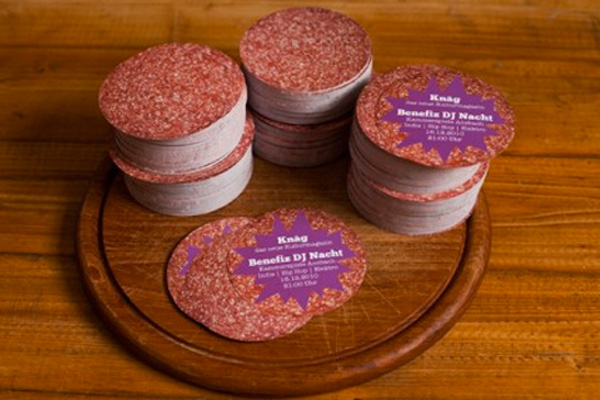
15 – Wurst

Wurst has proven, once again, that flyers don’t need to adhere to the standard rectangular shape.
In this example, as you can see, the flyers are perfectly rounded, and have been designed to look like salami.
It’s an interesting design choice, and one that could quite easily look cheap and low quality, but by keeping the design realistic and simple, the designer has managed to pull things off beautifully.


