Table of Contents
In the increasingly competitive world of e-commerce, online marketing is continually pushing the envelope when it comes to technologies used.
And one relatively new tool companies are utilizing more and more is the exit-intent technology.
Pop-ups, in its less annoying and more useful form as exit overlays, is a technology that looks to be around for a while, and perhaps something you should get into soon.
For the uninitiated, this exit-intent technology enables your site to track visitor activity, and with the use of predictive algorithm, detect site visitors who are forecast as about to leave (mainly through mouse movements, often within milliseconds). Once an abandoning visitor is detected, an overlay pops up to either entice the visitor back to the site or to a particular call-to-action (CTA).
This technology is crucial in a world where just getting people to your site requires a lot of effort and resources. As pointed out by KISSmetrics.com, a study conducted by Baymard Institute found that an average of 67.89 percent of shopping carts are abandoned by online shoppers. Even more telling, according to Monetate, in the third quarter of 2013, only 5.31 percent of international visitors even made it to the cart.
But like most marketing tools, it still has to be used strategically to make it successfully capture more conversions for abandoning visitors. Below are 10 examples of companies who have successfully made the technology work in their favor.
1. YourMechanic
YourMechanic sold the idea of the convenience of being online as opposed to visiting a brick-and-mortar repair shop.

Their success in using exit-intent technology begins with their landing page, which very clearly presents the numbers to call, the benefits their customers get, and the CTA “Get a Quote.” But for those still not convinced, an exit overlay pops up with the headline “So Easy It Only Takes 73 Seconds,” while a directional cue points to the more urgent CTA “GET A QUOTE NOW!”

A case study made about their exit overlay said that YourMechanic was able to convert 71.6 percent of abandoning visitors mainly because of the time-specific headline in their exit overlay.
2. Amen Clinics
This company is a provider of SPECT (single photon emission computed tomography) analysis, which diagnoses and then treats disorders like ADHD, memory issues, and a slew of behavioral problems.
As you’d find to be the trend on this list, Amen Clinics partners their exit-intent strategy with a landing page containing a lot of sound marketing techniques.
Unbounce points out that one of their landing pages, which has the headline “Healing ADD at Home in 30 Days,” uses a good contrast and whitespace, along with a big red button that focuses on their CTA.

But while they already had good starting selling points with offering to treat ADD at home, and being time-specific with “30 days,” their marketing team thought to offer in their exit overlay a test for people who were unsure if they had ADD in the first place. They were again time-specific, saying that the test would only take four minutes, while the CTA “Discover your ADD type” would allow those uncertain of their condition to try part of the program without a full commitment.

3. Gr8tFires
This UK-based company sells gas and wood burning stoves as well as fireplaces, and has been in business for over 30 years.

For their exit-overlay strategy, what they did was pretty basic, but ultimately effective. Right before visitors were about to leave their site, an overlay pops up with the CTA “Get Your Free Stove Installation Cost Calculator Now.” This is preceded by the headline, “No idea how much this stove installation is going to cost?” It answers a highly pertinent question if you’re looking to purchase their products, and provides an equally relevant solution.
4. XeroShoes
For those who find the concept of barefoot running and barefootware foreign, it might be hard to sell shoes designed for such use. XeroShoes understood this conundrum and designed their strategy to address the challenge.
Their exit overlay boldly claims “BAREFOOT IS BETTER!” while having the sub-headline “What shoe companies are hiding from you.” By just leaving their email addresses, visitors get a free research report detailing the benefits of barefoot running, and barefootware.

It was found that this approach prompted 2.5 percent of abandoning visitors to get the research, which eventually led to 28.4 percent of them to make a purchase.
5. Timothy Sykes
Online trader, entrepreneur, and penny stock trader Timothy Sykes took an aggressive approach when it came his exit overlay. He used a string of aggressive copies headlined by “BEING POOR SUCKS,” before asking “Do You Have What It Takes?” followed by the CTA “Apply Now for my Millionaire Challenge.”


Strictly in terms of an exit overlay copy, it’s in your face, straightforward, and for his line of business, it’s something that belongs.
6. Baby Age
Baby Age makes full use of the contrast technique by dimming out the main window and focuses on their exit overlay. In bright purple, it offers “$10 Off”, with a big timer showing how much time you have to shop and avail of the discount, and the CTA “APPLY COUPON INSTANTLY.”

Its benefits are attention grabbing, clear, and direct to the point, which could entice abandoning visitors to stay on the site and provide another window for conversion. And in a world where there is over 68 percent average documented online shopping cart abandonment rate, all the opportunities for conversion helps.
7. The Chive
The Chive, a website that gathers entertaining clips and stories from all over the Internet, took a bold approach when it came to the copy of their exit overlay, much like what Sykes did.

While it may not be definitive, having the headline “PROBABLY THE BEST SITE IN THE WORLD” definitely grabs attention. This copy followed by “is giving you the chance to subscribe to probably the best newsletter in the world” continues to draw your attention all the way to their CTA “SUBSCRIBE TO WORLD’S BEST NEWSLETTER.”
Concise and daring—if you think that fits the mold of your business, that approach may be for you.
8. QuickSprout
QuickSproute, a site that offers tools to help businesses improve traffic and conversion, gave its abandoning audience an incredible offer of 83 percent off on QuickSprout Traffic U’s original price.

There’s good use of contrast with the dimming of the window, while the exit overlay is bright green. The CTA is merely just to view the discounted offer, so there’s still no commitment there, while a 30-day money back guarantee accompanies the offer.
9. KISSMetrics
While you would expect visitors to analytics platform service provider KISSMetrics to a bit versed in data speak, they didn’t take any chances with their exit overlay by boldly stating “Aggregate Data is Kinda Worthless” followed by the more subtle “How to extract real results from all of your marketing channels,” which leads to the CTA “YES, Get the FREE Case Study Now.”

They make good use of contrast, while supporting why they should avail of the free help.
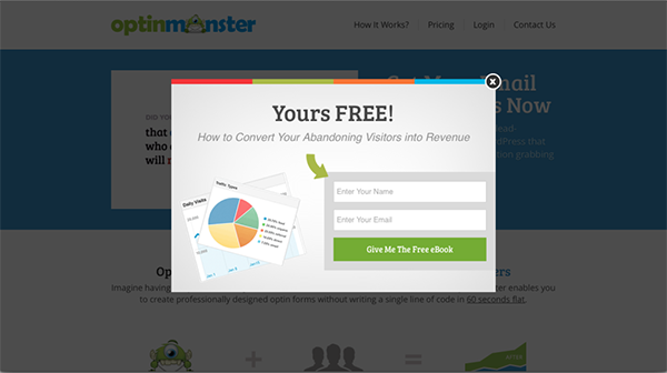
10. OptinMonster
Lead generator site OptinMonsterr keeps their main product in their exit overlay, offering a free eBook on how to convert abandoning visitors into revenue by un-ironically utilizing one of the techniques to convert abandoning visitors. In exchange for the abandoning users’ email addresses; you get a little more well-versed about what they just did to you.

As you can see, there are some very basic rules when it comes to exit overlays. However, like all marketing tools, there should be a clear understanding of your company and its goals, when deciding how to make use of exit overlays.


