Table of Contents
It’s all about user experience. If this has not been your mantra as you have designed and renovated your website, then it needs to become your mantra now.
And if you have a web design agency, then staying on top of the latest trends and choosing from among them to get the best user experience is the key to your own career growth.
When you sit down with a client to discuss a new website or the remodel of an existing one, the first question you need to ask is for whom the site is designed. What is the target audience? A design for senior citizen health aid products will be very different from the design for a clothier targeting millennials. And yet, within those specificities, there are some commonalities that should guide your current designs. Here are six of them.
1. Visuals and Media
This is not new, yet it bears repeating, because there are some newer trends that you should consider.
Explainer Videos: these are fast becoming the preferred method of communicating the value and benefit of products/services to visitors. And “how to” videos come close behind. It’s nice to have YouTube videos to which visitors can link, but imbedding them directly on the site is more convenient and streamlined. Whether your target customers are seniors at home on their PC’s or millennials on a commute to work with their smart phones, videos simply transmit the message better. Dollar Shave Club knocked this one out of the park with its video – total cost? $2500. Views so far? Millions.

Hand-Drawn Visuals: Everyone has photos. Consider hand drawn artwork instead. This adds interest. Even a hand-drawn logo seems cooler than one made up of pre-designed elements. Here are a couple of examples that work well:


Cinemagraphs: Taking a great photo and then having a part of it move is captivating. Viewers will spend some time looking at these, just enjoying the lifelike nature of this type of visual. For great examples, take a look at BlazePress. Here is one in which the globe spins:

2. Bold and Varied Typography
Typography says so much about who you are. Are your products/services fun, utilitarian, or serious? And different sizes can be used to direct your visitors. One word of caution here: Be certain that any typography you select will be supported across browsers and devices – otherwise, it can look weird.
Consider how Lego uses different typography based upon each product:

Or with a company that has a serious message but uses a different typography to depict common statements made by people involved in projects – two different types of typography – one serious, one more playful.

3. Giving Up the Grid
Sometimes it makes sense to stop worrying about “above fold” and “below fold” and grids. Use of a grid helps a designer stay organized, of course, but it’s so traditional. At a time when experimentation is embraced, try to move away from the grid to create unique experiences for users:
Single “hero” shots: A landing page that consists of one single photo or graphic can be compelling. Placing a small amount of that explains the site’s purpose can be superimposed – a pretty dramatic effect. Here is an example from Medium.com:

Designers can go beyond this too. Stacking photos, using unique linkage, etc. creates interest and a different experience for a user. Consider the site, Curious Space, a British design agency. Here is the landing page:

4. Single-Page Sites
Given that so many are accessing sites via mobile devices and smaller screens, it just makes sense to allow users to scroll down or swipe across, rather than click on links to get to other pages (think fat thumbs). Links take up needless space and unnecessary load time.

5. Parallax Scrolling
Background images that move slower than foreground images. This creates a great 2D scene with more depth and engages the viewer – it’s just a great thing to watch. While it has primarily been used on gaming sites, smart web designers can find cool uses for it in design. The key is not to overuse it.
The website Activate uses parallax in a cool way:

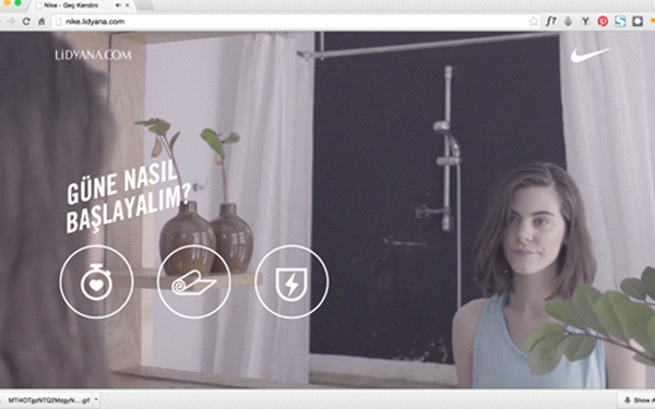
6. Telling A Story
Many companies have adopted a story telling format for their sites, featuring their products/services through either a video or a series of videos showing their use. Products can be featured on a side rail, but the real draw is the photos/videos. Here is an example of Nike showing the morning of a young woman and her exercise routine. The additional caveat is that the visitor can choose which type of exercise routine he wants featured – weight lifting, Yoga, etc.

Conclusion
These featured trends are only part of the picture. Lots of other trends, such as lazy loading, hamburger menus, and hybrid flat designs are just a few more of trends to be looking for as 2017 dawns. And new tools are being developed daily. The designer who stay “current” on these trends and yet understand the blend of traditional and innovative designs that will be right for a target audience will always be in demand.


